
Hello, does Charts.kt have KDE smoothing (for our histograms)?
Hi Nils, Charts does not have KDE smoothing built-in but I think it can be easily integrated as a double-mark chart (histogram + line).
The next version of Charts should include a histogram as part of the API (no more VariableColumn custom mark).
I’m working on an RC version this week, but I’ll try to produce some sample charts including KDE smoothing as a sample, as soon as I get some free time.
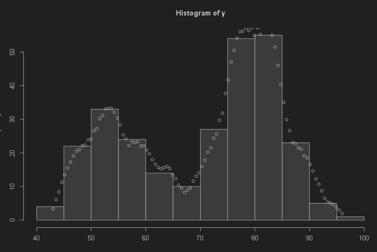
Hi @nils.knoblauch, have a look at this:
This is a verticalHistogram (actually experimental, will be included in the next major release) and a line with a custom dimension:
I translated the JS functions from your sample to Kotlin:
private fun kde(kernel: Int.() -> Double, threshold: Int, data: IntArray): Double {
    val kernels = data.map { d -> kernel(threshold - d) }
    return kernels.sum() / kernels.count()
}

private fun epanechnikov(bandwidth: Double): Int.() -> Double = {
    var x = this / bandwidth
    if (abs(x) <= 1) {
        0.75 * (1 - x * x) / bandwidth
    } else {
        .0
    }
}
And this is the chart:
chart(dataset) {

        val category = quantitative({ domain.threshold.toDouble() })
        val count = quantitative({ domain.count.value }) {
            formatter = { formatToPercentInteger(defaultLocale) }
        }
        val density = count.child({ kde(epanechnikov(bandwidth), domain.threshold, eruptions)} )

        verticalHistogram(category, count, constant(step.toDouble())) {
            strokeColor = constant(Colors.Web.lightgray)
            fill = constant(Colors.Web.lightgray)
            gap = 2
            y {
                enableGridLines = true
                enableAxisLine = false
            }
        }

        line(category, density) {
            strokeColor = constant(Colors.Web.black)
            strokeWidth = constant(2.0)
            curve = MarkCurves.Curved
        }
    }
If you have any questions, feel free to get back to me (mail, meet…).
Have a nice weekend.
Hello Pierre,
thanks for the reply. Unfortunately, we recognized today that the implementation in the link was wrong. You can see this also in your chart and on the D3 demo site: The density estimate does not have the same scaling as the histo bars .
Here is an R script using the right way to
a) compute the KDE density correctly as counts/interval
b) transform the counts / interval to the “counts” scale by multiply with the bin width of the histogram. This gives a very nice scaling when plotted on top of the histogram.
Another option would be to use always bandwidth=binwidth, which gives comparable detail.
—kde.R—
epanechnikov ← function(x) { pmax(0.75*(1-x*x), 0) }
y = faithful$waiting
bandwidth = 3 # kernel bandwidth
histogram_object = hist(y)
binwidth = histogram_object$breaks[2] - histogram_object$breaks[1]
kde = function(z) {
x = (z - y)/bandwidth
sum(epanechnikov(x))/bandwidth # returns count per interval
}
gridvalues = seq(min(y), max(y), length.out =100)
elapsed = system.time(
{
densities = sapply(gridvalues, kde) # applies a function element-wise
scaled_densities = binwidth * densities # convert density to counts within histo bins
}
)
plot(histogram_object)
points(gridvalues, scaled_densities)
—snip—
Some remarks on your code:
a) The values should be doubles, not integers
b) On how many points is the kde estimate computed?
i. on as many as there are histogram bars?
ii. you can set this number independently from the histogram bars
iii. on as many as there are original values (this would be bad as this is slow N*N scaling)
c) Will it be possible to show only the density estimate, but not the histogram bars? This is the way we will be using it to compare different groups of the data. Each group’s density line plots in a different color. The histogam bars would overplot too much for the different groups, therefore we would not want to show them.
d) Performance: The R script I sent computes the kde estimate on a grid of 100 points. Even with one million raw values, this 100 million iterations take < 2 seconds on my surface pro laptop. So I think this is good enough. But more advanced implementations like the one in R’s density() function use FFT to do fast convolution.
These are good questions, you’re right to dive a bit into this because Charts is a charting tool not a statistic or analytic one, and so, the binning for example must be done beforehand (I’m doing a simple dataset.map { ... } ) for my previous sample.
Therefore, we can have a specific data class containing the binned values, and the KDE for each bar, but we cannot have more points (more KDE values) than we have bars. In my sample 1 bar = 1 binned value = 1 KDE.
Of course, we can add a new feature, Charts is capable of stacking values, we can imagine it can also bin them.
Let me add that I’m not an expert in statistics, and some guidance from you would be invaluable.
To summarize:
-
I’m sure we can make this happen, however, it may need new features or a custom chart component
-
Is it something important for you? So I can allocate some time to develop this.
-
If yes, I think we’ll need to have a quick meeting with you and Martin, so we can plan a roadmap.
Let me know @nils.knoblauch
Just tweaked a bit my dataset to manage to have more “KDE points” than bars:
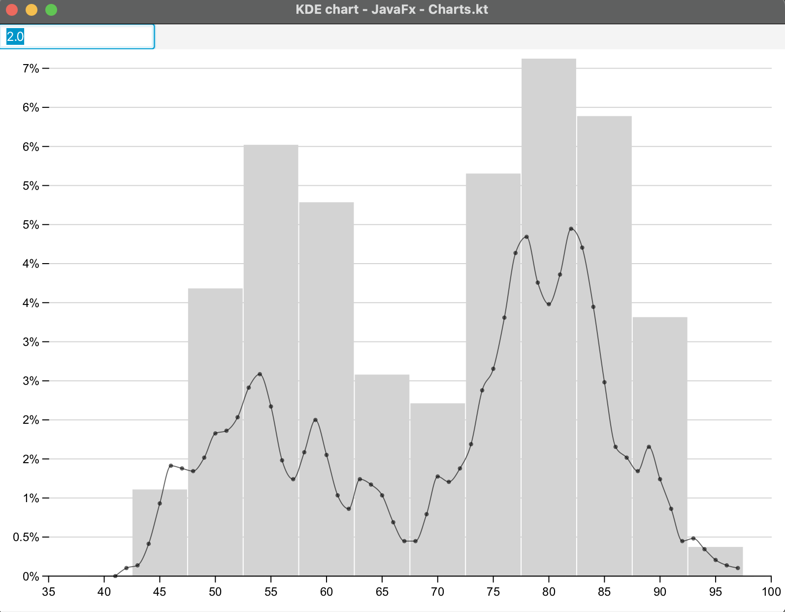
Here I bin 5 by 5 and display the KDE 1 by 1.
It’s the same code and dataset as the D3 example you gave me at the beginning of the thread.
Performances: I tried (on desktop) with 1 million raw values and the KD Estimate + rendering takes 0.2 seconds on my MacBook pro M2 max.
09:47:16.800:: 1000000 eruptions generated
09:47:17.025:: chart0 Init chart with initial size
As we do not need the KDE and the histogram plotted at the same time, I think we can just replace the histogram chart in our React layout with a vertically oriented line chart, showing the KDE estimate (on more points than histo bars) instead of the histogram (the user has a hotkey to toggle). So there is no need for additional development within Charts.kt if you do not plan to develop it in the direction of a statistical graphics plotting tool. An example is Plotly which offers specialized graphs for statistics, and also a kde in distplot
OK, so you should already have enough tools to display your results.
We will have a new and more robust histogram in the upcoming version (replacing the custom VariableColumn mark), you’ll see if it’s interesting for you to take a new license to use it in your application.